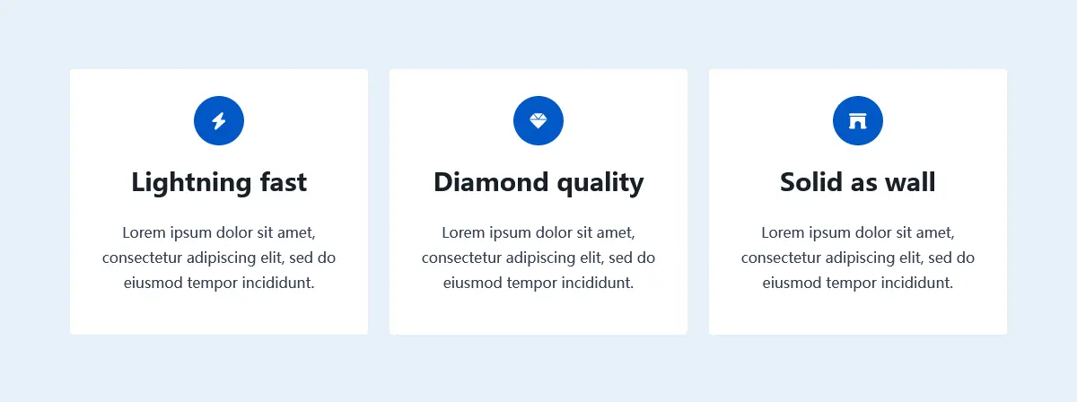
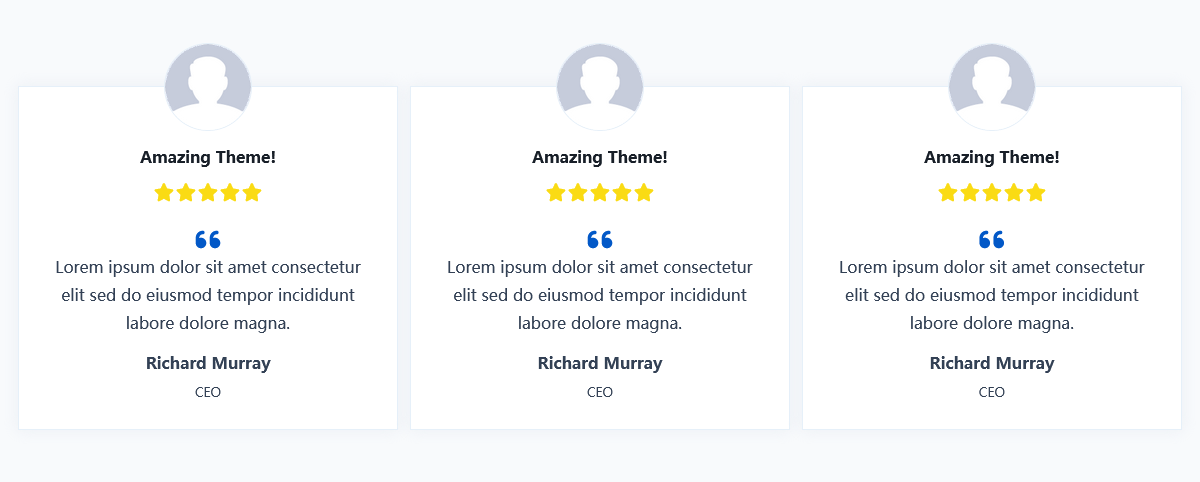
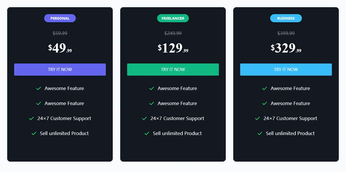
You may have already used the Section Block come with WordPress. It display content in multiple columns, with blocks added to each column. This is the most common layout block we use when designing a page. For example, a three-column layout with text like the one below.

It’s good, but it’s not enough. When we need more complex designs or want to adjust how it looks under different devices, it can’t help. Therefore, we have introduced an improved Section Block. It has a lot of customization options and you can style anything with no limits. And it is responsive, you can set different styles for different devices.
When you add a block, find the icon below and click on it to create a Section (KB) block.

After creating a Section (KB) block, you will see a Placeholder screen asking you to select the initial layout. Don’t worry, no matter which layout you choose or skip, you can easily modify the layout afterwards.

When the 33/33/33 layout is selected, you will see three columns appear in the editor. Each column has an Add button, which you can use to add new blocks to the column. After selecting the section block, the sidebar will appear with block options through which you can fully customize your Section block.
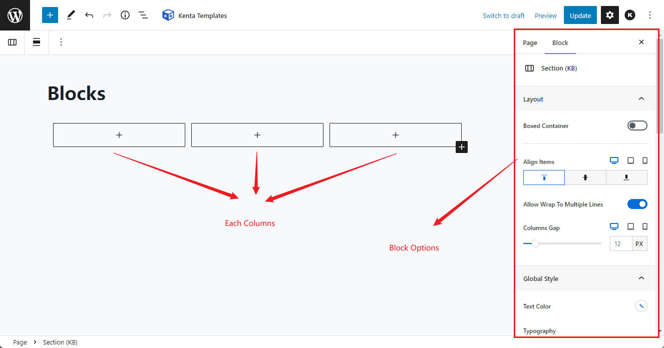
Let’s add some text for each column. Later, when you select any column, you can see that there are also a lot of customization options for each column.
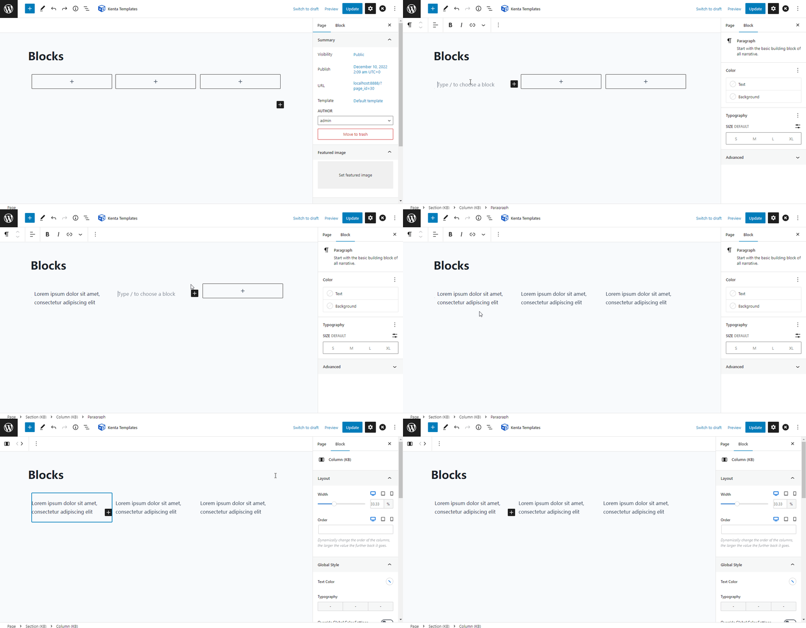
So how do you add or remove columns from an existing Section? Let’s show how to do it.
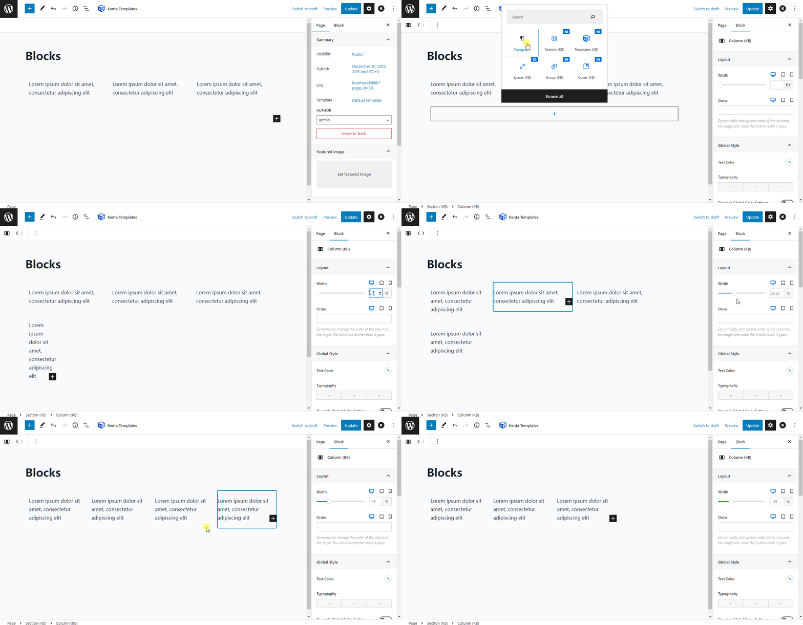
Please note the column width property, if you have more than one column you want to display in a row, then the sum of their widths cannot be greater than 100%. Otherwise the last column will be displayed in the second row.
Unlimited layouts and patterns can be created with Section (KB) blocks, here are some examples to demonstrate.
